The Art & Power of Typography - Typewriter Fonts

Typography.
Typography is not just about letters.
It’s about art. Culture. Design. Emotion.
The way a font curls, stretches, or stands tall can completely change the mood of a page. A single typeface can whisper, shout, feel nostalgic, or look modern and sharp. Typography speaks — often louder than we realize.
It has existed as long as writing systems have. But typography as we know it today was formalized and revolutionized in the 15th century with the invention of the letterpress by Johannes Gutenberg. From that moment on, the design of letters became both a technical craft and an artistic expression.
And then came the typewriter...
Typefaces in the World of Typewriters
When we talk about typewriters, fonts are called typefaces.
Unlike modern digital fonts, typewriter typefaces were physically embedded in metal typebars or typeballs (for example IBM selectrics). Each machine carried its own personality.
One defining feature of typewriter typography is monospacing — every character takes up the same amount of horizontal space. Whether it’s a slim “i” or a wide “m,” they occupy equal width. This uniform rhythm created the unmistakable aesthetic of typewritten text — structured, mechanical, yet beautifully balanced.
And this monospaced look still inspires digital fonts today.
Pica vs. Elite: The Classic Comparison
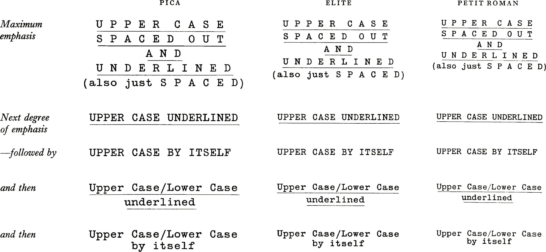
The two most common typefaces found on typewriters are Pica and Elite.
-
Pica types 10 characters per inch (CPI).
-
Elite types 12 characters per inch, making it slightly smaller and more compact.
Pica feels bold, confident, and highly readable.
Elite feels refined, tighter, and allows more text per page.
Both are incredibly versatile and get the job done beautifully — which is why they became the standard.
Beyond the Basics
Of course, there aren’t just two typefaces in the world.
Companies experimented with a wide range of sizes and letter styles. When you compare their type samples, you’ll notice differences not only in design but in character proportions, spacing, and personality.
Some feel industrial.
Some feel elegant.
Some feel unexpectedly playful.
There are hundreds upon hundreds of typefaces out there — far too many to list — and discovering them feels a bit like treasure hunting.
The Rare & Collectible Typefaces
Certain typefaces are especially sought after by collectors today.
Names like:
-
Bulletin
-
Vogue
-
Fraktur
-
Script, etc.
These are not just fonts — they’re conversation pieces.
A Fraktur or Vogue typewriter can easily fetch a couple thousand in an online auction. Rarity, condition, and demand all play a role, but the typeface itself often makes the machine truly special.
 v
v
Above is a Royal P typewriter with a special "Vogue" typeface. The type slugs are engraved "V" - that's how you identify "Vogue".

Personally, I find Royal’s Vogue typeface comparable in cleanliness to Hermes’ Epoca. To me, they both have that crisp, elegant look. Of course, someone else might strongly disagree — and that’s the beauty of typography. It’s deeply personal.

Above - Hermes "Epoca" typeface - more rare than script.

A sample of a double gothic typeface on an Olympia SG1 typewriter. Credits to E. Bruchez (via reddit)

Above a rare fraktur typeface. Source: renomail (via reddit)
The Beloved (and Debated) Script Typeface
One typeface many of my customers regularly message me about is Script, also known as cursive.
The moment some people see it, they fall in love — and immediately start searching for a machine that has it.
There are variations:
-
Tall cursive, with long ascenders and descenders.
-
Short cursive, with more compact letterforms.
It’s undeniably classic. Romantic. Expressive.
But it’s not for everyone. Some people find it tiring to read, especially in long passages. And honestly — I don’t think I’ve ever seen a 300-page manuscript typed entirely in cursive. Then again… I haven’t seen that many manuscripts.
And again - of course, as always, every company created their own version of the script typeface. So many forms of it exist nowadays.

How do I identify my typewriter's typeface?
There are many catalogs out there for each individual typewriter brand - these old catalogues often contained a detailed explanation of each typeface the company produced including examples of how the typeface looks.
Some of these catalogues have been digitalized and can be accessed online free source.
1) The easiest thing to do is to first identify which pitch your typewriter uses.
To do so, type any random 15 characters and then measure with a liner. If your typeface has 10 characters per inch - it might be PICA. 12 characters points to ELITE. Please, note not every 10 character pitch is a PICA, and not every 12 character pitch is ELITE, there were hundreds of typefaces - each with a different pitch.
2) The next thing you can do is zoom in on the type slugs
This is the end of the typebar which contains the letter/character. Sometimes the type slugs are engraved with an abbreviation. For example, Hermes used the following abbreviation:
SDE - Director Elite
SSC - Script
S6 - Pica
S7 - Elite
SDE - Director Speciale
SDP - Director Pica
SNO - Epoca
STE - Techno Elite
SPP - Petit Pica

On this Hermes typewriter you see a close-in inspection of the typebars reveals a "SDE" abbreviation which points to a Director Elite typeface.
3) You can also use the TWDB free source website
Compare your typeface to other examples to identify it - https://typewriterdatabase.com/
Why Typography Still Matters
Typography shapes how we read, feel, and connect with information. It influences emotion before we even process words consciously.
In a world of digital uniformity, typewriters remind us that letters have texture. Weight. Personality.
So next time you look at a typewritten page, take a closer look. Notice the rhythm. The spacing. The character shapes.
And never underestimate the power of typography.